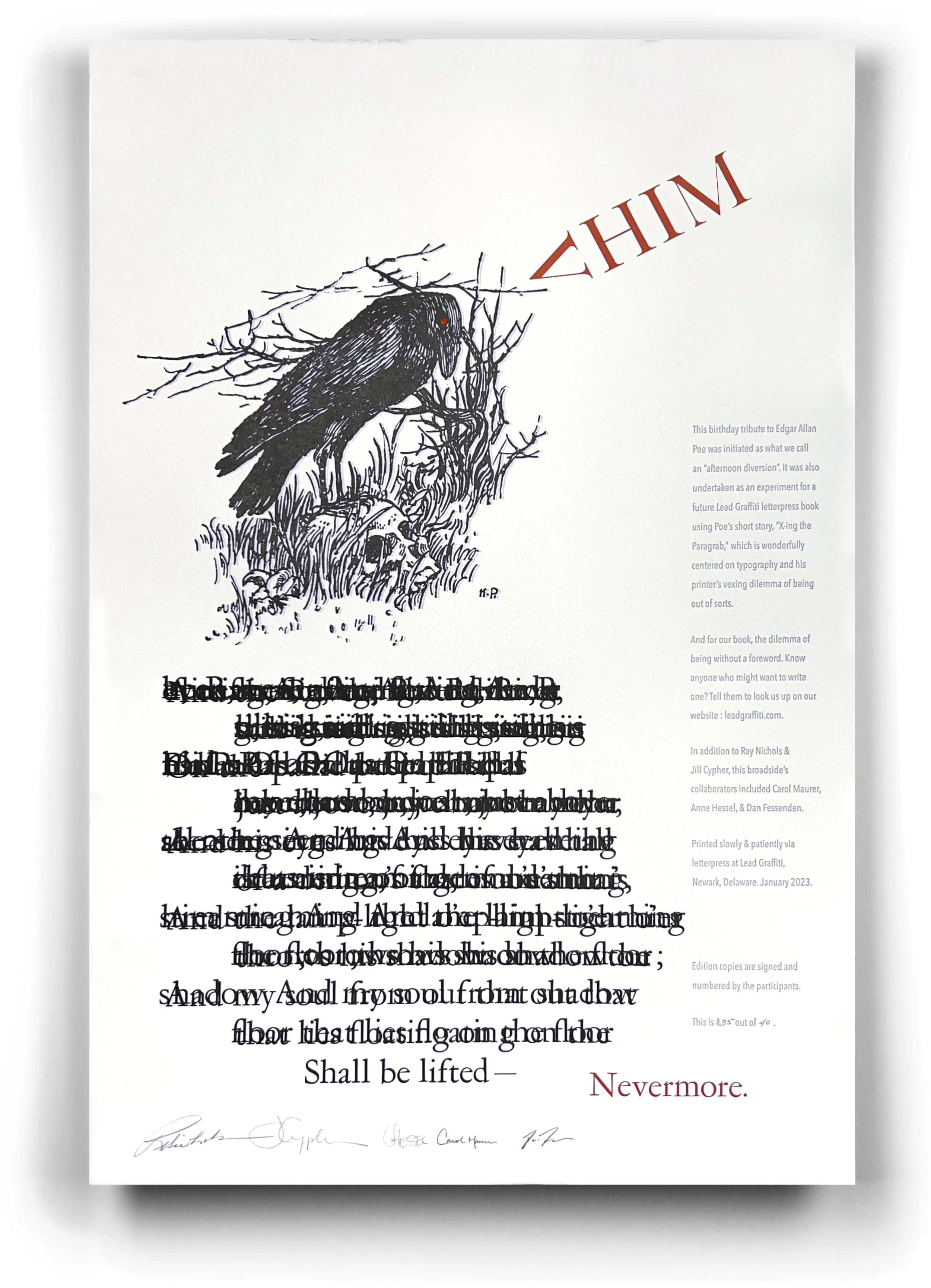
It is hard to be a letterpress printer and not have a soft spot in your heart for Edgar Allan Poe.
Poe wrote what we believe was his next to last published work before his death, a story entitled “X-ing a Paragrab.” The story is about two warring mid-west newspapers, where one owner sabotages the other by stealing all of his metal type os. So, to produce his newspaper, the robbed editor replaces the missing o’s with x’s. Ah, a perfect letterpress story.
We want to reprint the story “just because.”
Usually, if you print a text, there is nothing you can do with the text except print it like it was written. You can’t edit someone’s copywritten work. A while back, I read an article about reprinting existing texts, and it said to do this in a way that attracts buyers is to write a NEW forward that puts some new spin on the story.
So, that is why we printed the poster at the top of the page — to find someone who will write a new foreword for our version of “X-ing a Paragrab,” but in a highly reflective way of our creative attitude and style.
For instance, could you get away with a foreword that said, “Neverm re.” Or maybe “Nevermxre.”
We sent 30 copies of this broadside to various Poe enthusiasts, museums, & significant universities with a good English department reputation. We need a cool, new twist on Poe and “X-ing a Paragrab. Somewhat the person is going to need to get our attention. We’ll pick someone or do it ourselves on September 1, 2023.
The story of the broadside.
We had picked up a copy of a book entitled—- at a Delaware Bibliophiles Auction. I think I had gotten it either as one of several in a lot, where the critical book was another, or I had gotten it off the raffle table where you could trade raffle tickets for books you might have wanted but didn’t want to pay for.
A few years later, I was in the studio and grabbed something to look at while taking a printing break. I just opened it to the page with the illustration of the raven standing on a skull; I don’t remember ever seeing it before or didn’t think of it as a raven and had never noticed the skull—an excellent place to start. We took the last stanza of “The Raven” and printed the last line once. The next to last line twice while mixing the letters and repeated back up the stanza. Here’s the text so you can read it.
And the Raven, never flitting, still is sitting, still is sitting
On the pallid bust of Pallas just above my chamber door;
And his eyes have all the seeming of a demon’s that is dreaming,
And the lamp-light o’er him streaming throws his shadow on the floor;
And my soul from out that shadow that lies floating on the floor
Shall be lifted—nevermore!
Now let’s see what happens.