
Lead Graffiti is a 2,200-square-foot studio devoted to letterpress, often through broadside and book projects and many innovative workshops in letterpress and bookmaking. Primarily involved in their projects, they will consider working for clients with deep pockets and a creative partnering idea that would likely result in a solid Lead Graffiti portfolio project. They are also willing to consider collaborative projects. Feel free to contact us with your proposal.


Lead Graffiti is happy to announce a new collaboration with long-time friend and book artist Anne Hessel. We’ve established a “buy” section of our website devoted to her interest in designing and sewing blank books and encaustic work. Anne will arrange her area over the next few weeks, so feel free to look it over, but expect changes.


A few years ago, we spent much time working with a fellow letterpress printer, Bill Roberts, of Bottle of Smoke Press in Dover, DE. Bill often produced “Cinderella stamps,” which he used as part of the promotion process for various books he printed.
We have a nice Rosbach perforator, which allows you to produce the old-school holes between stamps, but controlling them is a “process.” We’ve used the perforator to include holes in several projects we’ve produced over the years. But now, adding our Boss laser cutter allows us a very controllable way of producing the holes.
So, we took our newest wood-type design, Reacshahn, as an opportunity to produce Lead Graffiti’s first set of Cinderella stamps. We’d like to include information about the stamps and the project it represents, but we don’t want to clutter the card. An added problem was finding a glassine envelope (like stamp collectors use) that was a good size. Sometimes, trying to do a project that feels right in almost every way is a total pain. We think we may just do a Zoo card to include with the stamps. This would give us more space, control, and the chance to include some full-color production shots. We’ll try to jump on that.

Lead Graffiti’s 1st wood type


September (August?) First Friday Eve happened
We highlighted our “IMHO” book produced by Upper Chesapeake Book Arts, shown below). You can read a more thorough explanation and the list of contributors by clicking here.
I might take this opportunity to encourage you to look at our “Opposites” book, also done in collaboration with the UCBO, on our YouTube channel. You can click here to see it.


Are there any V50 Miehle Vertical operators in the neighborhood?
We’ve been cleaning up our V50 to try and sell it. We haven’t used it in 20 years and were wondering if any V50 operator nearby wanted to stop by Lead Graffiti and tell some printing stories. Drop us an email.

⬆ This photo shows Jill (paste paper) and Deborah Arnold’s (poetry) new book from Lead Graffiti entitled “bouquet.”
Lead Graffiti’s “bouquet”
Jill (paste paper) & Deborah Arnold's (poetry) book entitled “Bouquet” - 36 pages was our best-selling book at the Manhattan Fine Press book fair in late March. We think we sold 6. We are producing an extra book and enclosure for anyone who has or will buy the book to make it the deluxe edition. You can see a more thorough description by clicking here.
Workshops / check calendar & shop
Interested in a letterpress or bookmaking experience? Please email us.
Current or newest projects or ones we could do (newest added at the top)
• Lead Graffiti has purchased a laser cutter to broaden the scope of options to include in our letterpress projects. One of the first things will be to work on the clamshell box to house a new book to accompany “bouquet” to complete the deluxe copy. One interesting option the laser cutter will offer us is to build a library of designs for clamshells and slipcases for future books.
• We did the APHA Zoom for Saturday, May 13, at 11am with Mizdruk (Jan-Willem van der Looij), a letterpress printer from The Netherlands. If you are into dense letterpress, you should look at the review we put on our blog.
•Waldorf School of Philadelphia diplomas. Below is the 2023 version of the letterpress / bookbinding project we’ve produced yearly since 2012. This was the first year since the start of Covid that the students came to the studio to produce the paste paper for the folder, handset the type for their names, and print the diploma. It's as cool a letterpress project as I’ve heard of.

• YouTube video of our Opposites project with the UCBA. The idea of adding 2 or 3 sentences by the artists as a VoiceOver the piece kind of slowed down the editing.
• Photographic series of physical wood & metal type-related images with California-based photographer Craig Cutler. Check out his website. Currently considering an alphabet book related to “protest.” To try to shoot sometime in May?

A few examples of our work at Lead Graffiti.

⬆ Newark Arts Alliance “Abstract” exhibition.
The Lead Graffiti book, “How Ink Writes Poetry,” was accepted to the Newark Arts Alliance exhibition entitled “In the Abstract.” The call for entries stated, “Work in any medium that depicts the subject matter in an unconventional and nonrepresentational manner.” The pages are “Ink Pulls” that we create using our Vandercook Universal III. The exhibit was juried by Rebecca Howell.
The exhibition runs from January 31 to February 24, with the public opening on Friday, February 10, from 6 - 8. The exhibition location is at the Newark Arts Alliance, 276 E. Main Street, Suite 102, Newark, Delaware. Maybe we’ll see a few of you there. Be sure to introduce yourself if we don’t know each other.
“How Ink Write Poetry” has been purchased by the Library of Congress.


⬆ New Impressions 2022 juried exhibition Hamilton Wood Type Museum
Lead Graffiti’s broadside “Teleport” was chosen by the judges for the Hamilton Wood Type Museum’s “2022 New Impressions” exhibition. There will be an exhibition during the spring, and a printed exhibit catalog available soon after. Printed in May 2021, the poster below was an experiment inking bubblewrap on our 1868 Washington #5 iron hand press.
For more details about the process and tools, click here.

⬆ Clamshell boxes for members of the Anne Arundel Community College Printmaking Club
Made to enclose a set of student prints at the Adkins Arboretum Visitor’s Center in Ridgely, Maryland.


⬆ A 2-year AFTERNOON DIVERSION
January 6, 2020, happened. I pretty much instantly wanted to do a broadside.
I don’t like zombie movies, but sometime around January the following year, I watched “World War Z.” Z stands for zombies who climb walls. Saw a photo from inside through a broken window of the Capitol building looking at the Library of Congress (one of my favorite places on the planet. Melissa Lentz, an essential student from my teaching days, was taking a Covid break from Apple, where she worked. She came to the studio, and we printed the type in February 2021.
I played around with how to do the glass. CLICK HERE for an explanation on Instagram (9 images) of how that was accomplished. Melissa returned to the studio, and we finished the broadside on November 20, 2022.
Size : 14.25” (w) x 22.5” (h)
Runs : 3 (title, credits, broken glass)
Stock : Stonehenge
Fonts : various
Press : Vandercook Universal III
Printed : November 2022

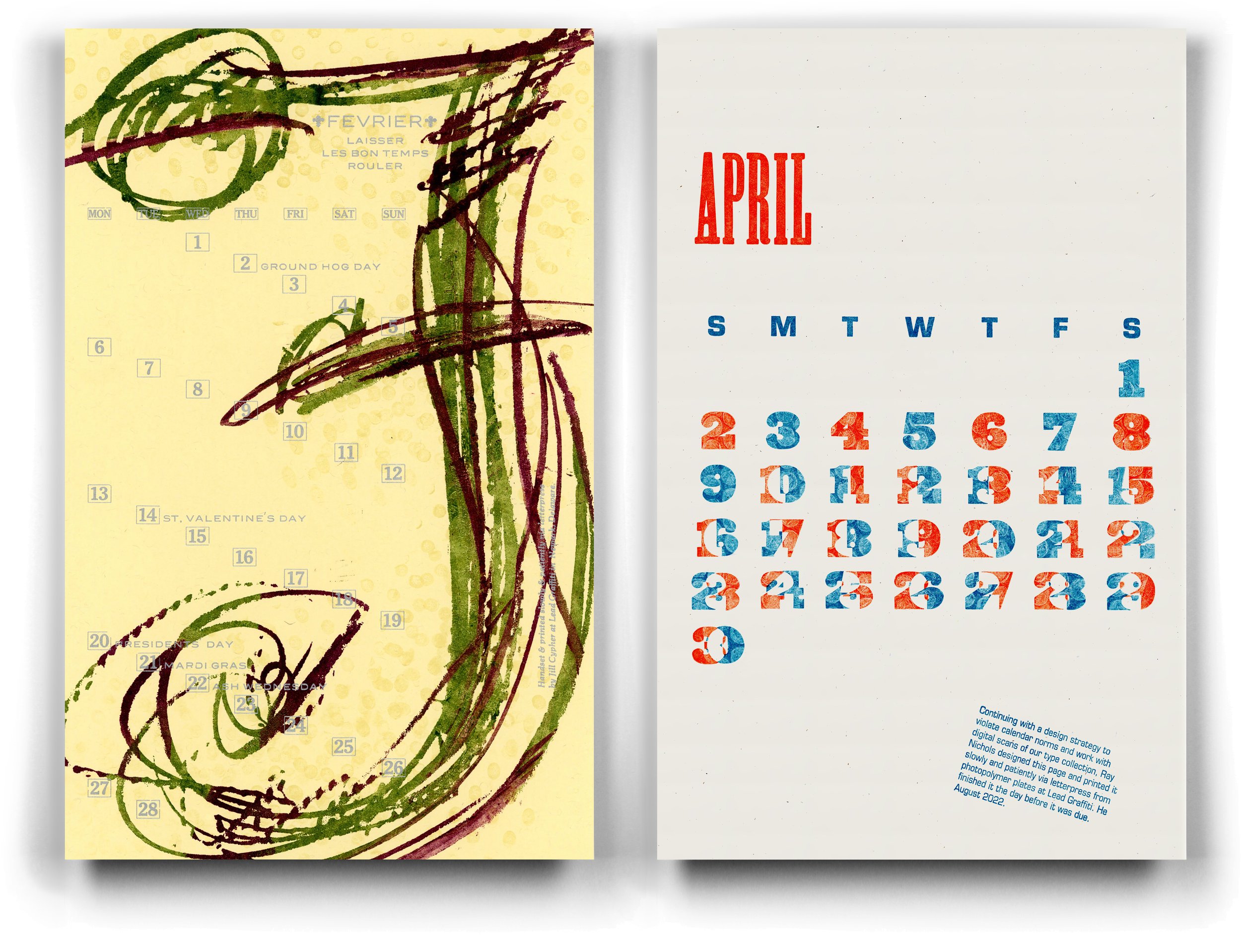
⬆ American Printing History Association 2023 calendar pages
February (Jill / left) and April (Ray / right) are 2 of the pages from 14 letterpress printing members of the Chesapeake Chapter. The calendar is for sale which supports chapter events. The edition is 130 prints.
Jill’s is printed from hand-rolled photopolymer for the “F” and handset metal type for all of the text.
Ray’s is printed from photopolymer using scanned wood type from their collection. The plates of overlapping numbers are inked and then hand-pressed with bubble wrap to subtract ink to create a visual unevenness.

⬆ No more war. No more Putin.
Size : 14.25” (w) x 22.5” (h)
Runs : 18 (title, credit, lines 1-3, each line 4-18)
Stock : Somerset Textured White, 300gsm
Fonts : 72 point Empire, 12 point Blair
Press : Vandercook Universal III
Printed : March 2022
Signed & numbered in an edition of 20; the broadside below represents Ray’s adverse reaction to the Russian invasion of Ukraine. It also means a continuing complicated experiment with ghost printing. The broadside is available for $60 (shipping is free), 100% of which will support the Ukraine relief effort. See details in our shop under “broadsides.”
WE SENT THE INTERNATIONAL RELIEF TEAM $1200.
—————
Hello Ray,
Thank you for your generous gift supporting families during the crisis in Ukraine. We are grateful for your generosity and could not do this without you.
Your gift details:
Amount: $1,200.00
Payment Method: Visa Use SECURE PAYMENT button below for Credit Card, Debit Card, PayPal, or Venmo ending in . . . .
Date: 5/3/2022
Designation: Ukraine Crisis
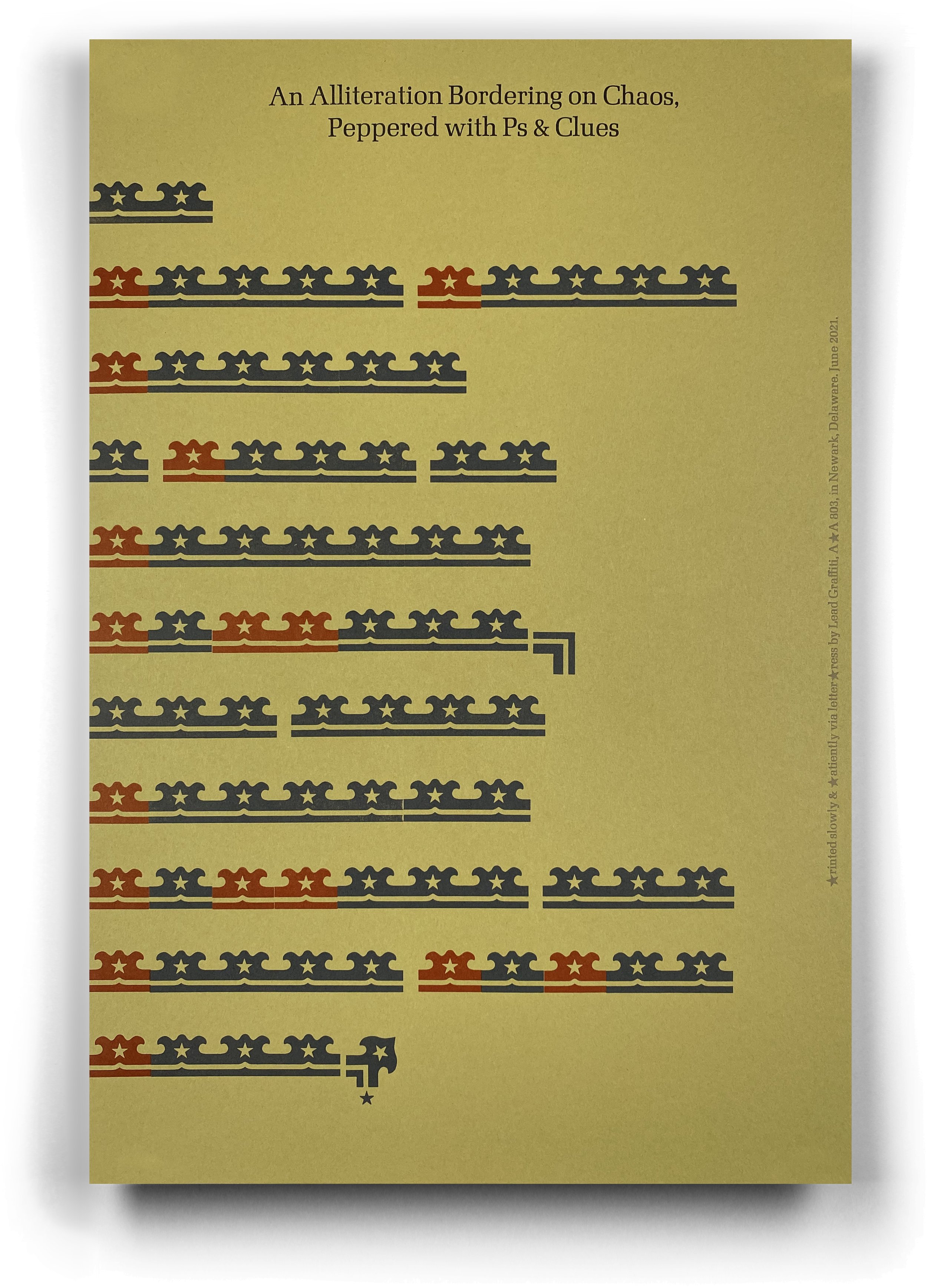
⬆ An Alliteration Bordering on Chaos, Peppered with Ps & Clues.
Size : 12” (w) x 18” (h)
Runs : 11
Stock : French Paper
Fonts : wood border material substituting for text
Press : Vandercook Universal III
Edition : 65
Printed : September 2021
The project was dreamed up by Tony Guadagnolo, a letterpress friend. Tony loves wood borders and he cut this one with his laser cutter. He made 4 sets containing various groupings and variations of the pieces you see. The main design is that “double” you see in the top line. There were singles, doubles, triples, and quads. There were also a few corner versions. You can see 2 of those at the end of the 6th and last lines.
The project was to use the border material in some fashion and an alliteration which is an occurrence of the same letter or sound at the beginning of adjacent or closely connected words.
We had a hard time figuring out what we could do, but once we got this idea, we were really happy with the results.
Here is information about the tongue twister courtesy of Mental Floss.

⬆ Somebody’s got a tight grip on Joe Manchin’s balls
Size : 14.25” (w) x 22.5” (h)
Runs : 2
Stock : French Construction Kraft, 100# cover
Fonts : various wood types from 4-line to 40-line
Press : Vandercook Universal III
Printed : February 2022
Signed & numbered in an edition of 20; this broadside is a reaction to our disappointment with the Democrat-but-Republican-leaning Joe Manchin. Printed in February 2022, it is for sale for $35. You can see details in our shop under “broadsides.”

⬆ First ONLINE Meander Book with Baylor University students’
Size : 16” (w) x 20” (h)
Runs : 2 custom mixed inks
Stock : Mohawk Superfine, 80# text
Fonts : various wood & metal fonts & printer’s ornaments
scanned from the Lead Graffiti collection
Press : Vandercook Universal III & Vandercook SP15
Edition : 70
Printed : September 2021
The colorful and typographically energetic results of the FIRST ONLINE OFFERING of our MEANDER BOOK workshop with a BAYLOR UNIVERSITY sophomore-level ART 3330 typography class. Students designed their pages and bound their no-sew-no-glue books in Waco, Texas. Via Zoom meetings, Lead Graffiti provided a design critique, composed and locked up the individual pages, and printed the text block in Newark, Delaware.
Printed slowly & patiently via letterpress
WELCOME TO LEAD GRAFFITI, a laboratory of sorts in Newark, Delaware, for all things letterpress—a place where you can do some serious experimenting, as well as creative & playful tinkering because :
WE BELIEVE we are part of a continuing story that passed through Johannes Gutenberg back around 1450.
WE BELIEVE creative pursuits should have a higher priority, both in time spent and value associated.
WE BELIEVE all people, especially kids, need the opportunity to experience “aha” moments and to learn the value of opposable thumbs.
WE BELIEVE in aggressively searching for the road less traveled.
WE BELIEVE in collaborating.
WE BELIEVE in knowing how to read a ruler, using tools, and doing math in your head.
WE BELIEVE in stockpiling “shelves” of ideas.
WE BELIEVE in working spontaneously and intuitively with those ideas.