
Homage to Shakespeare & the Boston Marathon Bombing


Homage to Shakespeare & the Boston Marathon Bombing
Celebration + commemoration + experimentation
WILLIAM SHAKESPEARE'S WORDS have been historically important to letterpress, so his birthday makes a good starting point for a broadside. Unfortunately this particular year, the Boston Marathon bombing clouded the bard's birthday. We decided to experiment to find a way to connect these two diverse topics. Shakespeare's perfect words got us started.
For the commemorative part, the visual needed to be thoughtful. Committed to using typography, we chose grey and rust to echo the pavement the runners had trod, the smoke, the darkness of someone's heart, the injuries suffered and the healing that was needed. And to bind everything together, we pulled out an untried technique of offset printing with letterpress equipment.
Step by step
BRIEFLY, the technique involves using a very hard, non-absorbent sheet of paper as a vehicle for transferring (or offsetting) ink from one surface to another.
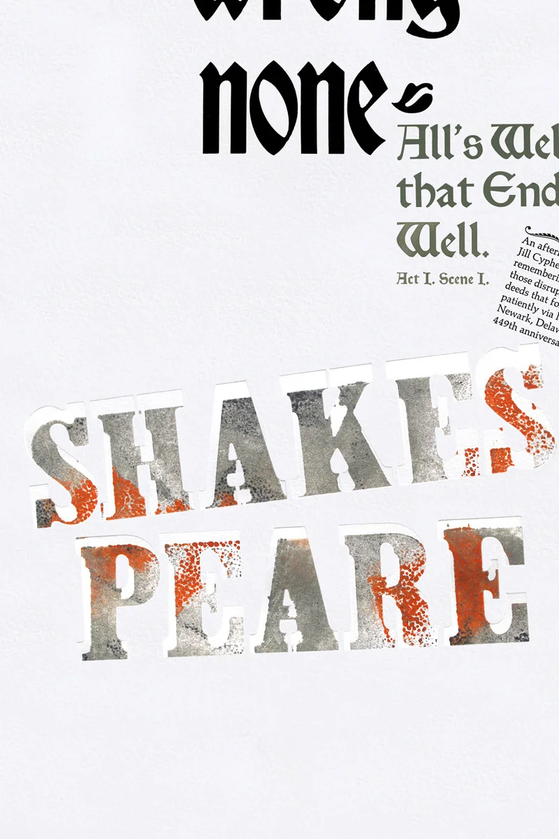
We hand set SHAKES / PEARE in bold wood type, locked it up in the press, and hand rolled it thickly in a painterly fashion with grey-, black- and rust-colored inks.
Using a small sheet of smooth, hard-surfaced paper, we pulled a print using very little pressure to try to maintain the painterly texture and retain as much ink as possible.
We then cleaned the wood type and shifted its lock-up position slightly in the bed of the press.
Feeding the just-printed hard paper back into the Vandercook’s grippers, we now printed (or offset) that ink back onto the surface of the wood type still in the bed of the press. Because the wood type was shifted, the inked hard paper now is out of register and small portions of the wood type will not get any ink transfer.
Next, we fed a sheet of our actual poster stock (Somerset Textured White 300 gsm) into the grippers and printed the just-inked wood type onto its surface. The type now appears as if it has been somehow partially masked off and blind debossed into the surface of the paper at the same time.
Printing this Shakespeare broadside was our first shot at an idea that had been bouncing around for a while : using the technique of offset printing with letterpress. The close-up below shows the blind-debossing with the offset-printed type. The inking rollers were not engaged at any time in this part of the process.
Step 1 : The Shakespeare name was printed three times. First (photo #2), from wood type that had been hand rolled in 3 colors (grey & black & rust) and printed onto about 40 sheets of hard paper (photo #3), using very little pressure to keep the most ink on the paper. When you heavily ink hand brayers, you often get what is called "orange peel," where the ink has a rough quality to it. We wanted to keep that quality, so we lightly rolled the black and the rust. Those small, heavy spots get squashed when you print the sheet using the press.
The second printing followed (photo #4) when that hard paper print was offset back onto the wood type that had been cleaned and shifted.
The third printing occurred when the broadside paper itself was fed into the press, and the partially inked wood type was simultaneously printed and blind debossed onto its surface (photo #1).
In the photo below we've already rolled the wood type fairly solid grey. We are now applying the black, very gently, to maintain that speckled quality.
Step 2 : We cleaned the wood type and changed its position slightly (the difference between the colored type and the blind-deboss).
Step 3 : We put the hand-rolled paper back into the press (we were using a Vandercook Universal III) and printed the ink from that paper back onto the wood type. Keep in mind that the wood type has been moved, so it is now askew.
Below shows the result of printing the sheet back onto the wood type, which has been slightly moved, before printing the sheet we wanted to offset.
Step 4 : Then we printed the type onto the broadside. So, Shakespeare's name took 3 runs to complete, though there is only 1 run that includes the broadside.
If you know how to letterpress and you understand our process of printing this broadside, you'll still be scratching your head.
Just for the record, we know we didn't break Shakespeare's name correctly between syllables. What fun would that be? We thought the type would have a shakey look and "Shakes" had a better feel to it. Keep in mind we were about 90% through a process we had only worked out in our head before we saw it on paper.
To purchase one of these limited edition prints, use the cart below.
Designed and handset in Bradley and Clarendon Extra Bold wood type and Caslon italic and Satanic metal type
Printed via letterpress in 3 hand-rolled colors, plus black & gray, on a Vandercook Universal III
Limited edition of 35 prints
Size 14.5" x 22.5" on acid-free Somerset Textured white, 300 gsm, with deckled edges at top & bottom
Total of 9 runs : Quote (3 runs / we only had one "o"), credit line (2 runs / we only had three "l"s), Shakespeare (3 runs which are explained above), and the colophon.